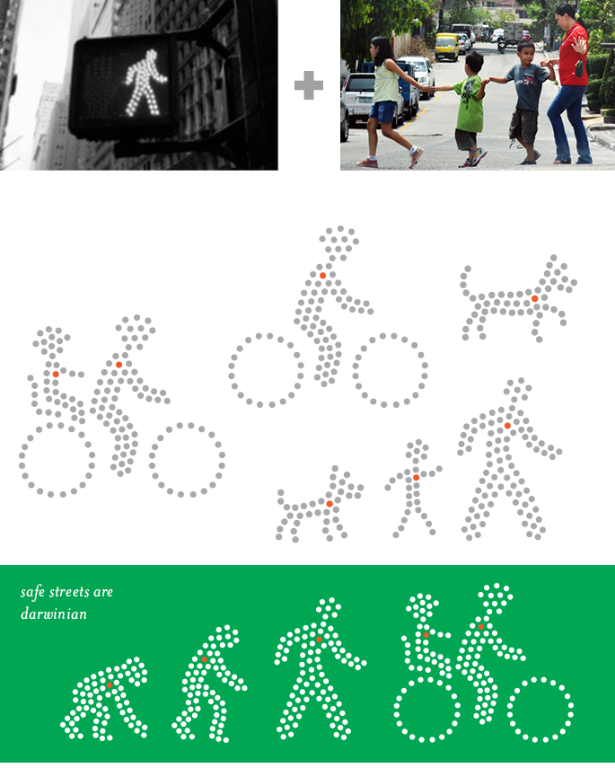
the visual language derives from street markings, signage, and high visibility reflective materials.
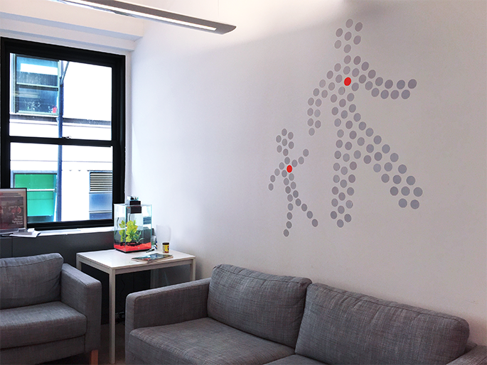
we needed a way to humanize all the safety visuals — to underscore the very personal cost of traffic violence — so we developed a cast of “walking person” characters...
the original mark is universally loved. however, the type – while attractive at small sizes – had a balloonish, juvenile quality when set over 14pt. we needed something more mature.
the wordmark employs a custom redrawing (based off Hoefler & Co’s Gotham). boldface letterforms were elongated slightly and corners rounded to make it a little less less stocky/stoic.
typography: Sentinel’s range and sentiment lend humanity to Gotham’s sterility. they pair to satisfy a range of cobranding and editorial needs.
letterhead printed orange and PMS silver; second page and envelopes printed opaque white on neenah astrobrights. the highly customized result was surprisingly budget-friendly.
members of our outreach teams handed out cards that double as reflective peel-off stickers; cards for other staff printed opaque white on 100lb Astrobrights cardstock.
website redesign
winter kit for our "pro team"
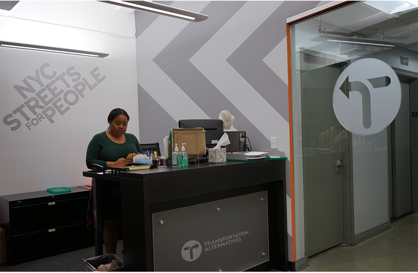
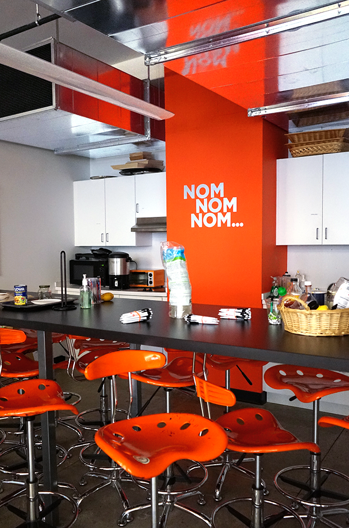
new office design (see gallery below for more from this project)


